

MILLIONS App is Turning Heads!
The new MILLIONS.co mobile app will increase accessibility to their services that is provided on their existing website for athletes promoting their products and fans who wish to purchase them.

Project Overview
During my internship that was completed August of 2023, a group of UX/UI Design interns took the time to execute critical thinking before designing innovative wireframing for the MILLIONS new application soon to be launched.
During this opportunity, I worked closely with the MILLIONS design team and contributed positively to brainstorming sessions and design critiques.
Roles
UX/UI Designer
Duration
4 months
Tools
Figma, Canva, Adobe Creative Suite (Adobe Illustrator)
Team
Individual Project
The Problem

How can we create a seamless, user-friendly app for athletes to effectively promote their products, memorabilia, and more?
It was important to keep in mind that the other key challenge was to reduce the amount of time necessary for users to interact with their favourite athletes and sports organizations. Keeping a simple format throughout the application will allow our users to navigate with ease and find what their looking for.
Design Goals
An all-in-one app designed to deliver real-time sports updates, live streaming, and seamless communication between fans and athletes.
Additionally, we were given specific design considerations by the MILLIONS Director of Merchandising and Design before designing our individual wireframes on Figma, we were informed about the companies colour palette, fonts, and more.

Bold text to maintain the current theme MILLIONS showcases
Colour theme is white, black, and gold (#D2AB64)
Consistent font (GT America) in the new MILLIONS app
User Research
As a team, the interns took the time to collect user interviews with potential users to inform our design decisions. Based on our findings, we were able to create 3 personas (Athlete, sports fan, and a sports organization) in order to understand each of our users goals, needs, pain points, and motivations.
Persona 1: Athlete & Social Media Creator
Persona 2: Sports Fan
Persona 3: Sports Organization & Gym Owner
User Feedback
After consulting with the Design team, I made necessary changes to the design before moving forward:
Create a seamless app design with the content of the page without it looking clustered.
Keeping the layout of the pages more consistent with other social media platforms our target audience uses (Instagram and X).
Staying aligned with the MILLIONS design goals throughout the entirety of the design.
Medium-Fidelity 📝
My medium-fidelity prototype for the MILLIONS application was iterated and perfected after more productive meetings with coworkers, including the Head of Design and Merchandising.
Sign Up Pages
I decided to implement a feature that allows users to choose user type:
An athlete
A gym owner/trainer
Or just a fan!

Landing Page

Login Page

Sign Up Page

Sign Up as Athlete
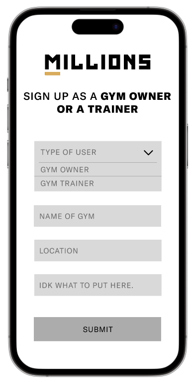
Sign Up as Gym Owner or a Trainer

Sign Up as a Fan
Main Pages
Explore Page: view other user’s content (aligning with their algorithmic feed and preferences)
Notifications Page: showcases user’s notifications from previous days.
Profile Page: view their own profile & personal info or change their settings.
Viewing Someone’s Profile Page: you are on someone else’s profile page.
Watch stream Page: watch their sports streams of choice.

Home Page

Explore Page

Notifications Page

Profile Page

Edit Your Profile Page

Viewing Someone's Profile Page

WatchStream Page
Purchasing Pages
Purchasing a product
Having a tip option
Purchasing athletic merchandise
Purchasing a personal video
Purchasing an experience with athlete of choice

Order Product Page

Tipping Athlete Page

Order Merchandise Page

Ask Athlete Anything Page

'How Does AMA Work?' Page

Order Experience Page
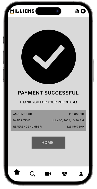
Payment Successful Page
Exploring Change for the Better
After performing qualitative research - Guerilla Testing - participants were able to share their honest opinions about how they felt when interacting with our design.
Designing an app for solely athletes will avoid clustered UI and eliminate overcomplexity when using the app.
High-Fidelity 🖥️
This new iteration of the MILLIONS app will solely focus on the athlete being the main user instead of implementing all user types. Since the companies main objective is to promote their athletes, our design team agreed that this was the best way to move forward.
Sign Up Pages
For starters, here are the updated sign up pages:

MILLIONS Landing page

Login Page

Step 1: General Information

Step 2: Social Medias

Step 3: Personal Information about Athlete
Main Pages
After the athlete as logged in or signed up, now the user is navigated to the main pages of the application. These pages were designed with simplicity in mind to create content with ease.

Home Page

Type of Product Page

New Product Page

New Memorabilia Page

Type of Content Page

New Image Page

New Video Page

Successfully Published Page

New Stream Page
Profile Pages
This section of the application in particularly centers around the athletes needs, such as:
Profile Settings: profile picture, user’s nickname, biography
Sales tracking: product, video, experience
Account Settings: contact information, social medias, profile information, addresses, change password, delete account
Logging Out

Profile Page

Profile Settings

Sales Page

Account Settings Page

Log Out Pop Up

Delete Account Pop Up
Key Takeaways
Designing an app for all the user types was not easy. Implementing all features the current website has was not user-friendly and overwhelming for participants.
✅ Solution was hidden behind qualitative research outcomes that would've been difficult to extract without further investigation on the MILLIONS users and company goals. It is better to design with simplicity in mind rather than trying to satisfy everyones needs. The easier the app is to use, the better the user experience is for our MILLIONS athletes.
❎ If it were possible to start over, I would simplify the design process by allocating more time to the iteration phase — specifically to deepen our understanding of our target users before advancing to medium-fidelity prototyping. This would have allowed for more thorough user research and insights, rather than prematurely defining our user personas. Our process led to a viable solution, earlier user-centered research could have uncovered deeper insights.
